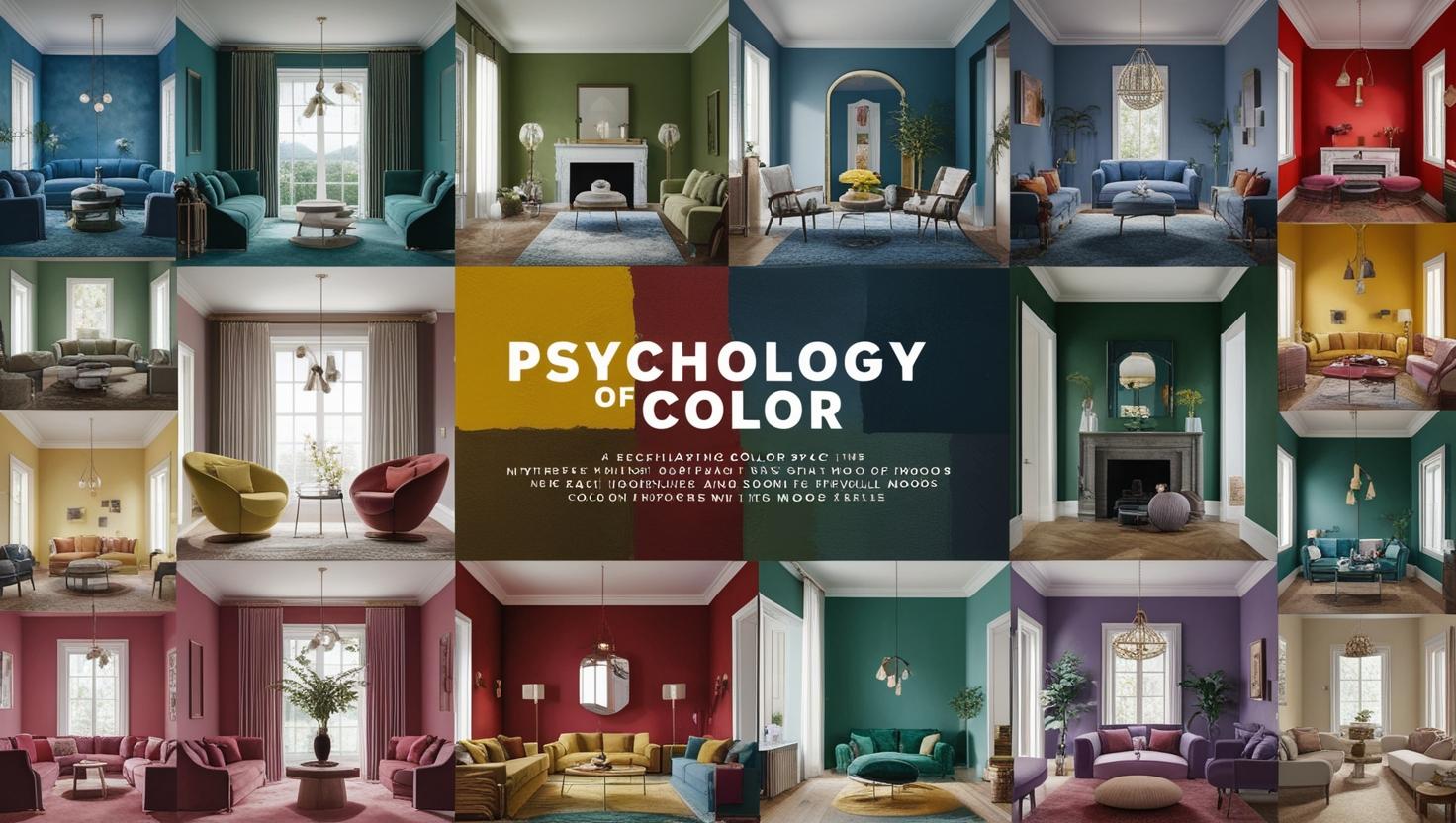
Unlocking the Secrets of Hue: The Psychology of Color in Interior Design
Have you walked ever into a room and instantly felt a shift in your mood? Maybe a burst of energy in a vibrant yellow kitchen or a sense of calm washing you over in a serene blue bedroom? That’s the power of color psychology at work,silently shaping our experiences within interior spaces .As interior designers, and indeed anyone interested in creating beautiful and functional homes understanding this powerful force is paramount. This post delves into the fascinating world of color psychology in interior exploring design how different hues can impact our emotions behavior and overall well-being.Let’s embark on this colorful journey together!
What Colors Whisper to Your Soul ? Deciphering the Emotional Impact of Hues
Color isn’t just a visual element; it’s a powerful language that speaks directly to our subconscious. Think about your favorite color – what emotions or memories does it evoke? For me it’s a deep teal; it reminds me of calm ocean waves and peaceful summer evenings.That’s the personal connection color holds,but beyond individual preferences, there are universally understood emotional responses certain to colors.
The Warmth of Reds and Oranges: Energy and Excitement
Reds and oranges are vibrant energetic colors often associated with passion excitement, and even aggression.a Imagine restaurant designed with bold red accents – it naturally stimulates appetite and creates a lively atmosphere . However overuse can lead to feelings restlessness of or overwhelm. designers Interior often use these colors strategically perhaps an as wall accent in a dining room or a playful splash in a child’s playroom. Students of interior design should learn to master the art of balancing these bold shades with calming neutrals to prevent sensory overload .
The Calming Embrace of Blues and Greens: Tranquility and Serenity
In stark contrast to the fiery energy of reds and oranges blues and greens evoke feelings of peace tranquility and serenity.Think of a spa designed in soothing shades of seafoam green and sky blue; it immediately induces relaxation. These colors are perfect for bedrooms bathrooms and spaces meditation helping to create a haven of calm. As aspiring interior designers,you’ll learn how effective these colors are in promoting relaxation and sleep .
The Neutrals: Versatility and Sophistication
Neutrals like whites grays and beiges are the chameleon of the color world . They provide a blank canvas for other colors to shine and create a sense of sophistication and calm. They’re not boring ! Different shades of neutral can create vastly different moods. A warm beige creates coziness while a cool gray can feel modern and minimalist. Students often overlook the power of neutrals, but mastering their subtle is variations crucial for achieving balance and elegance in any design .
How Does Color Affect Our Behavior ?the Navigating Psychology of Space
Beyond emotional responses , color significantly impacts our behavior within a space. Understanding this interplay is crucial for creating functional and user-friendly interiors . Let me a share personal anecdote. I once designed a home office using a stimulating bright yellow. While it initially felt invigorating after prolonged use it became overwhelming . My client a writer found it difficult to concentrate .We eventually toned down the yellow with calming blues and grays resulting in a much more productive workspace.
Color and Productivity: the Finding Right Focus
Bright yellows and greens are often associated with increased productivity but as my anecdote shows too much stimulation can lead to distraction . For workspaces a balanced approach is crucial. A mix of calming blues and energizing yellows carefully incorporated is ideal for fostering focus and creativity. Students should consider this when designing their own study spaces opting for calming and productivity-boosting colors.
Color and Appetite: The Power of the in Palette Dining Spaces
Have you noticed that many restaurants use warm inviting colors like reds and oranges? It’s no coincidence!These colors stimulate appetite and create a lively ambiance. However cool colors, like blues are often associated with suppressing appetite. Interior designers carefully consider these effects when designing restaurants and kitchens. This is something aspiring interior designers should be mindful of when working on projects involving spaces associated with food and meals .
Beyond the Basics: Cultural and Personal Preferences in Color Selection
While there are universal responses to certain colors , cultural and individual preferences play a significant role in shaping color choices. What might be considered auspicious in one culture could be deemed unlucky in another.deep A red, for instance symbolizes luck and prosperity in many Asian cultures, but in some Western cultures, it can be associated with anger or danger.
Respecting Cultural Nuances: A Global Perspective on Color
As interior designers it is vital to be sensitive to these cultural differences. When designing for diverse clientele research and understanding of cultural color symbolism are non-negotiable. Students should familiarize themselves with the diverse cultural connotations of color expanding their awareness beyond a generalized understanding .
Personal Color Preferences: Tailoring Designs Individual to Needs
Finally and perhaps most importantly, individual preferences should always be considered. While understanding the psychology color of provides a framework valuable,the ultimate goal is to create a space that resonates with the client’s personal style and emotional needs. Experienced interior designers know how to blend the principles of color psychology with personal expression to deliver exceptional results.

The Future of Color Psychology in Interior Design: Embracing Technology and Innovation
The field of color psychology in design interior is constantly evolving . New technologies such as virtual reality and augmented reality are enabling designers to experiment with color schemes and visualize their effects in innovative ways.
Virtual Design Tools: Revolutionizing the Creative Process
VR and AR tools allow clients to experience a space before it’s even built helping them make informed color choices . This interactive approach significantly improves communication and collaboration between designers and clients minimizing potential misunderstandings.Interior design students are now learning to use these cutting-technologies edge integrating them into their design process .
Biophilic Design and the Integration of Nature’s Palette
The growing interest in biophilic design , which aims to integrate natural elements into indoor spaces is further influencing the use of color.Natural color palettes inspired by nature’s calming greens and soothing blues, are becoming increasingly popular. This trend highlights the emphasis growing on creating spaces that promote well-being and connection with nature.
Conclusion: Painting Your World with Purpose
Understanding the psychology of color is not just about aesthetics; it’s about crafting spaces that truly nurture and our enhance lives.As interior designers students and home owners alike can utilize this knowledge to create environments that foster productivity relaxation and overall well-being. By thoughtfully integrating color psychology into the design process we can transform houses into homes, offices into havens of creativity and public spaces into vibrant hubs of human experience .
